
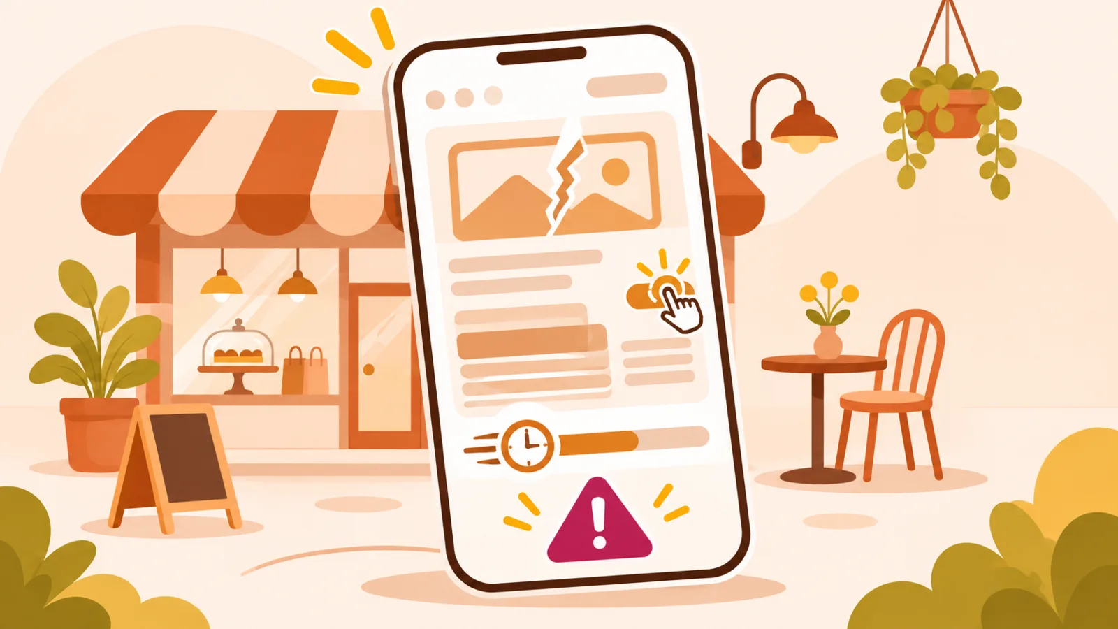
Mobile web page: 8 mistakes that lose customers
Someone may discover your business through search, a social story or a QR code. They often open the page while standing outside with little time and a small screen. A good mobile experience does not make visitors guess where to tap: it makes the useful information obvious.
Eight common problems
Watch for a vague headline, oversized image files, tiny text, crowded navigation, an untappable phone number, a hidden booking link, unclear directions and outdated details. Each problem adds friction exactly when the visitor needs a quick answer. Improving the basics can matter more than adding another effect or animation.
Put information in the right order
Start with your business name, what you do, where you are and the most important action. Follow with hours, services and extra details. Use descriptive headings, short paragraphs and link labels that explain what happens next. If you have one primary goal, such as booking, make that action clear without surrounding it with competing buttons.
Test as a visitor would
Open the page on a real phone over mobile data, not just on your computer. Try calling, opening directions and completing the booking journey. Check text size, tappable areas, contrast and what happens when loading is slow. Ask someone unfamiliar with the business to find your opening hours without instructions.
Quick mobile checklist
- Business type and location are obvious.
- Text is readable without zooming.
- Contacting or booking takes few steps.
- Images do not hide key details.
- Links work by touch and keyboard.
Start with a simple, practical web page for small businesses.